while i've been wrassling with these questions, i've also been thinking about the future of this project, and how the overall impact of this graphic novel has had on it's viewers. is this jes' another piece of art that you can find by hitting the "next' button on the blogspot toolbar? have you remembered the storyline as it's progressed to the point where you're "in the story?", or what? i'd be foolish to think that this project is going to have some profound effect on anyone's life, but i'm curious what people really think about my work - other than the normal compliments.
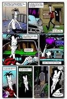
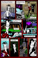
i decided this time around to post 2 versions of this latest page of the 'reflections' storyline. along with the theme of increasing the overall impact of each page, i'm playing with ideas that would eventually effect the final look and feel of a finished piece. in this case, it's an introduction of a backdrop gradation: rich blood tones to accentuate the overall mood of the panels. a common mistake many artists make is the lack of presentation. whether is the paper, colors, bindery or simple factors of a poor layout - it's all part of the impact that leaves that distinct impression with the readers.
... so, tell me your favorite in this sample and if you would... why?


on another note, yet a repetitive one, please remember that once you click on the image to view larger, you repeat the the rollover gesture with the mouse on the image. THEN you can click on the small box that appears in the bottom righthand side to see the image in full 600dpi.

11 comments:
I like the red background, gives the storyline a darker edge without being crude, or overbearing. I feel for our poor hero.
adrianne, you feel for him, eh?
jes' wait...
thank you for your comments!
:)
B
feel...granted that I have some catching up to do....but what exactly are you asking?
I need you to explain this whole process to me, even the project itself...where do you see yourself gong with this?
I want to help! And I want to understand how YOUR mind works.
good vibes,
xo darlene
b/Sister --
long and short of it, without reading the background writings of mine on the prev. 'reflections' posts:
created in early 90's. produced a limited run that got destroyed in a fire... thought i lost it all... friend sent me original (well, photocopies he had) of my work, i've been slowly restoring them for the past 2 years. only RECENTLY online to get feedback on how it's going.
So, comment on the other site was to see/fish/garner any interest on if i'd actually produce any physical copies eventually, or jes' keep it online.
overall, i jes want peoplz to read and enjoy my work. i've been FOCUSED on this project lately, and not doing my airbrushing or other stuff lately...
BUT, to answer yer other question, if YOU can figure out how my mind works, please lemme know.. i don't have a clue.
:)
HUGS<
B
I actually had to go back and forth a lot. I like them both. I like the grey because it popps out your story more (your ice blues in particular), it brings it out. BUT - the red evokes emotion, it draws you in with feeling.
"ice blues" -- i like that.
thanks wifee
you're super talented! keep on writing and drawing!!! :)
i love vampire stories (i used to be a goth when i was younger).
you are so very talented!
After viewing both, the red background has a more powerful effect/affect. It tends to remind me of a potential danger that our Sean seems to be oblivious of.
I am tempted to tell Henry, BEWARE!!
As for your mind, persona, beingness. It will evolve. It will continually change. My guess is that you will become an even more caring person.
As a self-centered narcissist myself, I caution you about getting so absorbed in self. It can only bring more pain. You can never quite measure up to whatever goal/image/?/ you set for yourself. It takes time and effort, but paying more attention to serving others is prolly the most self-serving thing you can do. The dividends are so much greater.
serve others, care about those you serve, and share the love in your heart.
(Jes a reminder.)
Red! REd! RED!
I like it ^_^
I've missed out on so much :(
No worries, I've read the posts that I've missed
Cant wait to see what happens next!
~K
this is a way cool blog too. red background for me. You are one talented dude!
Post a Comment