i've spent time in my past teaching others to draw. i'm actually doing this right now with a friend when she and i find time for lessons. that's another one of my joys. teaching what i have learned and watching someone realize their own amazing potential; whether coming from the point of a pencil, pen, chalk, conte or paints.
recently i was sorting thru sketches of old. most are from my college years comprised of life drawing classes, but some also included contracted portrait works with models and more. i wanted to share some of, what i see as the beauty of work. plus, i decided to have fun with some of these pieces with scans and photoshop manipulations to see what kind of neato effects could be achieved.
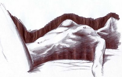
this first sample of some of my character studies dates back awhile, but i thought it would be a good start. the original sketch is from college and too big to scan..., but thankfully i can duplicate any work quickly if given time. this piece was redrawn on simple unlined white notebook paper using black ballpoint ink. i experimented with cross-hatching pen strokes and more to create the shadows and contours of the models exquisite form:
the next phase of this post is continued in the next post due to some weird tech. issue i'm having uploading (2) scans into one entry... so read more above!


7 comments:
-b, you are very talented. Thanks for sharing. I look forward to additional drawings.
Did you intend for the line at the left to serve as a cuff for the arm that extends from it?
Just a thought.
jack, how embarrassing is this that i don't understand the first question someone has offered up...?
jeez.
if I can attempt to answer, the arm is left intentionally minimalized due to it's not the focus of the piece. it's only meant to highlight the basic shape and definition - leaving the rest to the imagination.
the LEG to the left is also only suggested by a bold defining line to suggest a leg raised.
the lighting on the original model was so harsh it created these equally HARSH lines and defining edges. while it may look like the torso is coming out of a base shape, it's indeed her raised upper thigh.
does that help answer your question? if not, please excuse my ignorance and I'd love to hear more.
my best,
B
My son can copy his work somewhat the same way, just by looking at it while he is re-drawing it. I want him to put some of his work on-line somewhere as well.
I couln't resist coming back to visit this one either.
I can hardly wait for the next selection.
dude that chick is skinny
it's gorgeous.
Just browsing...this is just *beautiful*...absolutely amazing.
Post a Comment